b3ta.com presenta a sus usuarios un curioso reto, encontrar logotipos reales con símbolos fálicos subliminales, es decir, sin que en principio el cliente tuviera consciencia de ello y por tanto los espectadores del logo tampoco.
Algunos son menos subliminales que otros:
We asked our readers to send in the best cock logos from around the world for our team of experts to evaluate. Now we present to you the very cream of the cocks.

Who: Beauty salon in West London
Pro: «I’ve just received a flyer through the door from them offering me a 10% discount on a facial.» writes John Dinwoodie, «I do hope it’s give rather than receive.»
Cons: Large bollocks makes us think think of tea-bagging.
Cock mark: 78%

Who: some kind of German volleyball association
Pros: It does look like a cock. German sausage.
Cons: Minus points for lack of ballage. Also it looks like a an aquafresh jellyfish.
Cock mark: 80%

Who: 80s schoolboys favourite bag. Oooh. Head bag. You’ve got a head bag. You’re special.
Pros: Dramatic close-up. AND it’s famous. AND it’s got a funny name.
Cons: Doesn’t look much like a cock. Damn.
Cock mark: 47%

Who: Irish equality authority bods
Pros: Looks like a dick with 3 nails driven into it.
Cons: Implausibly large urethra.
Cock mark: 60%
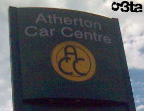
Who: Atherton car centre
Pros: Perfect cockage.
Cons: Grossly swollen balls. Or is it just a tiny penis?
Cock mark: 90%
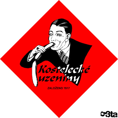
Who: Czech sausage company
Pros: Great 1920s transvestite oral sex action.
Cons: Two meat. No veg.
Cock mark: 46%

Who: Stereotypical Japanese website
Pros: Looks like it’s having sex
Cons: But you’re looking at it from the inside
Cock mark: 23%

Who: America steakhouse
Pros: Ambitious front perspective. Angry hues. Some seepage.
Cons: Doesn’t make us want to eat there.
Cock mark: 94%

Who: Estate agents
Pros: Full cock and balls. Solidly constructed.
Cons: Some subsidence.
Cock mark: 65%

Who: Wakefield Council
Pros: ‘I have just finished working for wakefield council,’ spurts ayuplass,’Before I left we were issued with the new headed paper including our new logo. The logo was displayed proudly at the top as is usual for letterheads but the A4 sheets included a large water mark based on a section of the logo. The green part that looks like a spurting cock. Everyone spent Monday running round saying «Have you seen the new headed notepaper?» My section head sent a letter to PR saying «Do you realise it looks like a big knob?»‘
Cons: It only works if you twist it.
Cock mark: 58%
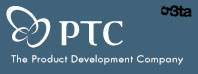
Who: The Product Development Company.
Pros: Nice and abstract. Pleasingly bulky. Proudly errect.
Cons: It’s just three circles isn’t it?
Cock mark: 42%

Who: Pontins holiday camp.
Pros: Secret cock in logo of household name shame.
Cons: Unorthodox choice of letter to be so endowed.
Cock mark: 97%
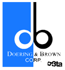
Who: Printing specialists Doering & Brown
Pros: Secret cock. Elegant, gracefully curved testes
Cons: Thin, reedy shaft
Cock mark: 86%
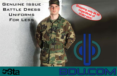
Who: Military uniform supplier
Pros: Ambitious angle – forwards flaccid with emphatic testicles
Cons: Makes the poor army man look gay
Cock mark: 79%

Who: Engineering consultancy
Pros: A nasty, shrivelled full set of cock and balls
Cons: A bit too arty
Cock mark: 85%
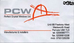
Who: Fitted window company
Pros: «I actually bought a window from these people. It was very reasonably priced.»
Cons: Looks like an action painting of some horrible penis mutilation.
Cock mark: 94%
And the winner is…
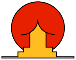
Who: Brazilian Institute for Oriental Studies
Pros: Oh, just look at it.
Cock mark: 100%
Deja una respuesta